Color Madness The choice of color for repairs is always a difficult and important issue. Color in the interior solves two important problems. Firstly, it sets the atmosphere, and secondly, it affects the perception of space.
Basic principles of using color in design
Before choosing one color palette, they usually analyze the temperament of the inhabitants of the house in order to create a harmonious atmosphere. Thanks to the color, you can either emphasize the character of a person or neutralize certain of his features. For example, bright colors in the interior are invigorating and uplifting, and if you are more passive, then staying near such colors for a long time will give you energy. Conversely, if you are constantly working, and are in a very active pace of life, calm neutral shades will balance.
It should be remembered that for many years you will be under the influence of the energy of one color or another, and therefore you need to know what it carries with it.
Color Madness: Combining Multiple Bright Colors
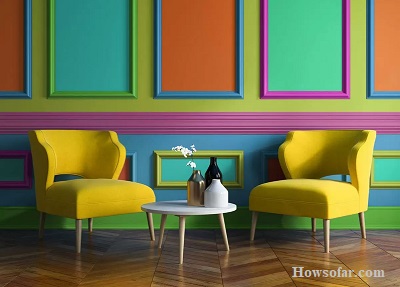
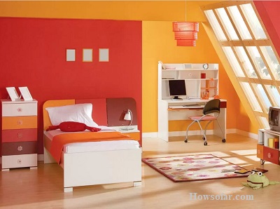
The combination of colors gives the space dynamism and energy. The best rooms for color experiments are the kitchen, living room, bathroom, and nursery.
Principles of color combination
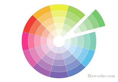
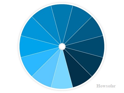
In order to successfully make bold combinations, you should use the Itten color circle. There are three most harmonious principles of combination in this circle:
- A color triangle, when shades from sectors are combined, which together form an equilateral triangle. For example, yellow-blue-red, pink-blue-orange, etc.
- A close variant to the previous one is the so-called “accent of analogy”. Three related shades are selected and one contrasts from the opposite side of the circle. On Itten’s color palette, they form an imaginary isosceles triangle.
- Tetrad, or a selection of four contrasting colors. Complimentary combination when shades can be entered into a square. This is a variant of a very contrasting palette, where two hot colors are balanced by two cold ones.
The Role of Color in Design
When combining several contrasting colors, the following recommendations should be followed:
- For a combination, it is better to use no more than three colors.
- The base background should prevail on the finishing materials of the walls, ceiling, and floor. Secondary tones are used for furnishings.
- Up to 75% of coatings and finishes must be in the base shade. Secondary shades occupy 20% of the surface. The remaining 5% is used for color accents.
Monochromatic color schemes
The monochrome use of flowers speaks of the calm and refined taste of the owners of the premises. This palette is typical for modern, rustic, Scandinavian, and classic styles. Here the secret is to interestingly combine shades of the same color.
In addition to the fact that the color is split into darker and lighter shades, they also play on the textures and textures of materials. They use geometric prints, matte and glossy surfaces, and light and heavy fabrics of the same color, in general, they play on shades of one color or another in various ways.
When creating a monochrome design in the interior, mix no more than five shades and make them repeat all the time in different places in the room. Staying in this palette, play with textures: the same color is perceived differently on a smooth and embossed surface. The easiest way is to start with the color of the wallpaper or textiles with a pattern, choosing plain surfaces as a pair.
Shade Tips
There are no clear rules for the selection of shades. But the architecture of the room itself will dictate the use of one color or another. We will highlight three basic principles for using monochrome.
You can also get Creating a Stylish Children’s Room: 10 Tips and Ideas
- The first principle of combining shades in a monochrome interior: large-sized elements (walls, floors) – the lightest shade; pieces of furniture – darker; accessories – the darkest.
- The second principle: for the dominant, you can choose some dark colors. However, for such a decision, choosing a combination of shades can be somewhat more difficult. It is worth implementing it only if you are sure that the rich color of the walls will not darken the room. Also, remember another important detail of such an interior – a light carpet. It will make the room brighter by neutralizing the dark shades of the walls.
- The third principle is uniformly light monochrome interiors, which are created with slight differences in tones in terms of lightness. They are best suited for rooms:
- with windows facing north;
- with low ceilings;
- darkened;
- designed for relaxation.
Uniformly light interiors look airy and delicate. However, you should not abuse the excessive use of a light palette, because a fog effect may appear and the picture will lose its clarity.
FAQs
1. What are some popular color combinations in design?
Answer: Some popular color combinations in design include blue and orange, green and purple, and different shades of a single color.
2. How do colors affect websites?
Answer: Colors can impact websites by making certain elements stand out, like buttons. Different colors can also evoke different emotions in visitors.
3. Are colors important in design?
Answer: Yes, colors are important in design because they can convey messages, create moods, and grab attention.
4. What do warm and cool colors mean?
Answer: Warm colors like red and yellow can make people feel energetic and excited. Cool colors like blue and green can create a sense of calm and relaxation.
5. Do colors have different meanings in different cultures?
Answer: Yes, colors can have different meanings in different cultures. For example, while white represents purity in some cultures, it symbolizes mourning in others.